

How to Match Glaze Colors to Your Garden's Palette
I used to glaze pots in whatever color I happened to be excited about that week. A bright turquoise phase. A moody charcoal phase. A brief and regrettable neon orange phase. Then I started paying attention to how those pots looked once they were out in the garden, surrounded by leaves and flowers, and I realized I had been thinking about glaze color in isolation. A pot does not exist on its own. It exists in a place, next to plants, under a particular kind of light.
That shift in thinking changed the way I approach glazing. Now, before I mix a bucket of glaze, I walk around the garden and look at what is actually there. Not just the flowers, but the foliage, the bark, the stone, the fence, the sky. The garden has a palette whether you designed it or not, and your pottery can either harmonize with it or create deliberate contrast.
Reading Your Garden's Palette
Start with the dominant colors. Most gardens, even small ones, are built around a handful of greens. Are your greens cool and blue-toned, like rosemary and lavender? Or warm and yellow-toned, like golden oregano and Japanese forest grass? The undertone matters. A cool green garden pairs beautifully with glazes in the blue-green family: celadon, seafoam, muted teal. A warm green garden tends to look better with glazes that have a little ochre or amber in them, even if the main color is something else.
Next, look at your hardscape. Brick, stone, gravel, wood, metal. These are the neutral tones that everything else has to live with. A terracotta pot against red brick can feel heavy and repetitive. The same pot against gray gravel sings. A glossy white pot against weathered wood looks crisp and modern. A matte black pot against pale stone looks dramatic. There is no single right answer, but there is a right answer for your particular corner of the world.
Finally, consider the light. Gardens in full sun tend to wash out pale, subtle glazes. A soft gray-green that looks elegant in the studio can look almost white in bright afternoon light. Shade gardens, on the other hand, can handle more nuance and depth. A deep plum glaze that looks almost black in sun will reveal its color in shade. If you are glazing for a specific spot, try to imagine the pot there before you commit.
Using Contrast on Purpose
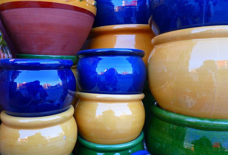
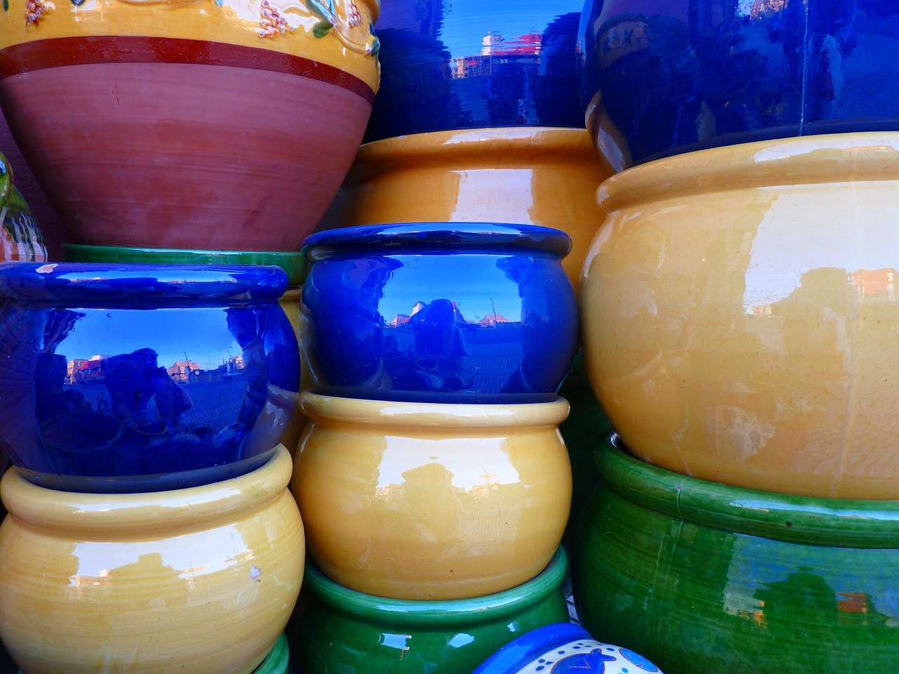
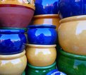
Harmony is lovely, but contrast is what makes a garden interesting. If everything matches, the eye has nowhere to rest. A single pot in a color that does not belong can be the thing that pulls a whole border together. I have a small, glossy cobalt pot that sits among muted greens and grays, and it is the first thing every visitor comments on. It does not match anything. That is exactly why it works.
The trick with contrast is to keep it deliberate and limited. One or two strong colors, not five. A cluster of matching pots in a single bold color reads as a statement. The same bold color scattered randomly reads as clutter. Group your contrasting pots together, or place them at key focal points, and let the rest of the garden be calm.
If you are unsure, test before you commit. Glaze a few small test tiles, fire them, and take them outside. Hold them up against your plants, your fence, your soil. You will learn more from five minutes in the garden than from an hour of staring at glaze charts. And if a pot turns out wrong, you can always plant something in it that distracts from the color. A trailing nasturtium hides a multitude of sins.
Your garden already has a color story, and your pottery can either echo it or push against it in interesting ways.
Moving a plant into a handmade pot is an act of trust, and a little preparation goes a long way.
You do not need a dedicated room to make pottery, just a corner of the garden, a bit of shelter, and a willingness to get muddy.
Learn what to expect when you sit down at the potter's wheel for the first time, from centering the clay to pulling your first wobbly but wonderful walls.
Terracotta and stoneware pots do more for your herb garden than look pretty on a windowsill, and here is why clay is worth the investment.